The Role of Color Theory in Effective Sign Design
Color is more than aesthetics—it determines how quickly your sign gets noticed, how clearly it communicates, and what emotions it triggers in Bay Area customers.
Key takeaways
- People make subconscious judgments about products within 90 seconds—up to 90% of that assessment is based on color alone.
- WCAG accessibility guidelines recommend a minimum contrast ratio of 4.5:1 for normal text and 3:1 for large text.
- High-contrast combinations like black on white or yellow on black provide maximum readability for outdoor signs.
- Color increases brand recognition by up to 80%, making consistent color use critical for business signage.
- Consider cultural context when choosing colors—red signals luck in China but danger in Western contexts.
Color theory is the foundation of effective sign design. It determines whether your Bay Area business sign gets noticed in a crowded streetscape, how quickly passersby understand your message, and what emotional response it triggers. Understanding how colors interact gives you a practical advantage when creating signs that work.
Research from the Institute for Color Research shows that people make subconscious judgments about products within 90 seconds of initial viewing—and between 62% and 90% of that assessment is based on color alone. For your sign, that means color choices directly impact whether potential customers walk in or walk past.
Why does contrast matter more than any other factor?
Contrast is the single most important element in sign readability. A sign with poor contrast might look appealing in a design mockup but becomes invisible from across the street or illegible at highway speeds.
The Web Content Accessibility Guidelines (WCAG) provide concrete standards: text should have a contrast ratio of at least 4.5:1 against its background for normal-sized text, and 3:1 for large text. While these guidelines were developed for digital content, they apply equally to physical signage—especially for ensuring accessibility.
High-contrast combinations that work well for outdoor signs include:
- Black on white (or white on black)—the highest contrast available
- Yellow on black—used universally for warning signs because of its visibility
- White on dark blue—professional, readable, and versatile
- Dark text on light backgrounds—generally easier to read outdoors
When we fabricate custom aluminum signs for Bay Area businesses, contrast is one of the first design decisions we address with clients. Getting this right means your sign performs in full sun, at dusk, and under streetlights.
How does color psychology influence customer perception?
Colors trigger emotional responses that influence how people perceive your business before they read a single word. Understanding these associations helps you align your signage with your brand message.
Red communicates urgency, energy, and excitement. It grabs attention and has been shown to stimulate appetite—which is why red dominates restaurant signage. For San Francisco and Oakland storefronts competing for attention, red elements can make a sign pop.
Blue is the world's most popular color, with 57% of men and 35% of women ranking it as their top choice. It conveys trust, stability, and professionalism. Banks, healthcare providers, and tech companies in San Jose and the Peninsula often gravitate toward blue for this reason.
Green signals growth, health, and environmental consciousness. It works well for wellness businesses, organic products, and outdoor-related services throughout the Bay Area.
Yellow represents optimism and energy but should be used strategically. Too much yellow can cause visual fatigue. It works best as an accent color or paired with a dark background for maximum impact.
Black adds sophistication and elegance. Fashion retailers, luxury brands, and tech companies frequently use black to communicate premium quality. It also creates excellent contrast with almost any other color.
What color schemes create visual harmony?
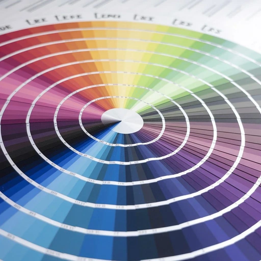
The color wheel—a tool that dates back to Sir Isaac Newton's 17th-century discovery of the color spectrum—remains the most reliable guide for creating color combinations that work together.
Complementary schemes pair colors opposite each other on the wheel (like blue and orange, or red and green). These create vibrant contrast that demands attention. They work well for signs that need to stand out but require careful balance to avoid visual conflict.
Analogous schemes use colors adjacent to each other on the wheel (like blue, blue-green, and green). These create a harmonious, cohesive look that feels balanced and professional. They work well for brands emphasizing reliability and consistency.
Monochromatic schemes use different shades and tints of a single color. This approach creates a sophisticated, unified look while maintaining clear visual hierarchy through value contrast.
A study from the University of Loyola, Maryland found that color increases brand recognition by up to 80%. This means your sign's color scheme isn't just aesthetic—it's a strategic tool for building customer recognition throughout the Bay Area.
How should you approach accessibility in sign design?
Accessible design isn't optional—it ensures your sign communicates to everyone, including the approximately 8% of men and 0.5% of women with some form of color vision deficiency.
Key accessibility practices include:
- Never rely on color alone to convey information. Use text, symbols, or patterns as backup.
- Maintain high contrast between text and background (4.5:1 minimum ratio).
- Avoid problematic color combinations like red-green, which are difficult for people with the most common forms of color blindness.
- Test your design using color blindness simulators before production.
When our team handles professional sign installation across the Bay Area, we help clients verify that their signs meet accessibility standards before they go up. This prevents costly revisions and ensures compliance with local regulations.
What about brand consistency across different sign types?
Your brand colors need to work consistently across exterior signs, interior wayfinding, vehicle graphics, and promotional materials. This creates a unified visual identity that customers recognize instantly.
The challenge is that colors appear differently depending on the medium:
- Digital screens (RGB) display colors using light, which appears more vibrant
- Printed materials (CMYK) use ink, which can appear more muted
- Illuminated signs change color appearance when lit from behind or with spotlights
- Outdoor signs shift in appearance based on time of day and weather conditions
Professional sign fabricators calibrate colors across these mediums to maintain consistency. If your business uses Pantone or specific brand color codes, share these with your sign maker to ensure accurate reproduction.
How do cultural factors affect color choices in diverse markets?
The Bay Area's cultural diversity means your sign may be interpreted through many different cultural lenses. Color associations vary significantly across cultures:
White symbolizes purity and cleanliness in Western cultures but is associated with mourning in some Eastern cultures.
Red signals danger or urgency in Western contexts but represents luck and prosperity in Chinese culture—relevant for businesses in San Francisco's Chinatown or serving Asian communities throughout the region.
Yellow can indicate caution in Western signage but represents royalty and spirituality in some Asian and Middle Eastern cultures.
Understanding your target audience's cultural background helps you choose colors that resonate positively rather than create unintended associations.
What practical steps should you take?
Applying color theory effectively starts with clear goals:
- Define your sign's purpose. Is it for brand awareness, wayfinding, safety, or promotion? Each purpose suggests different color priorities.
- Know your environment. Where will the sign be installed? What colors surround it? Signs need to stand out from their visual context, not blend in.
- Start with contrast. Choose your text and background colors first, ensuring they meet minimum contrast ratios for readability.
- Test in context. View your design at actual viewing distances and in different lighting conditions before committing to production.
- Get a physical proof. Colors on screen always differ from printed or fabricated results. Request a sample to verify before final production.
Whether you're launching a new San Jose storefront, updating Oakland retail signage, or adding wayfinding to a San Francisco office complex, color choices directly impact your sign's effectiveness. Take time to get them right.
Ready to discuss your sign project? Start your project with SF Bay Signs, or view our gallery to see how color theory comes to life in real Bay Area installations.