The Power of Kerning in Custom Sign Lettering
Kerning—the adjustment of space between specific letter pairs—can make or break your sign's readability and professional appearance. Understanding this typography fundamental helps create signage that communicates clearly from any distance.
Key takeaways
- Kerning adjusts space between specific letter pairs, while tracking applies uniform spacing across all characters.
- Poor kerning (called "keming") can cause words to be misread—potentially damaging your brand reputation.
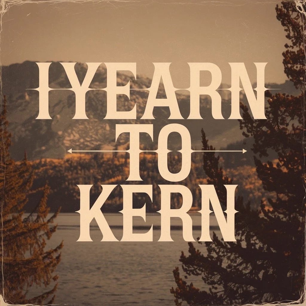
- Common problematic letter pairs include AV, VA, Te, To, LT, and WA—these often need manual adjustment.
- For every 10 feet of viewing distance, increase letter height by 1 inch to maintain readability.
- Professional sign makers combine proper kerning with appropriate letter height for maximum impact.
When customers see your sign, they should notice your message—not awkward letter spacing. Yet kerning, the fine-tuning of space between specific letter pairs, often gets overlooked in sign design. The result? Signs that look unprofessional, are difficult to read, or worse—convey the wrong message entirely.
This guide explains what kerning is, why it matters for vinyl lettering and custom signage, and how professional sign makers ensure every letter pair creates visual harmony.
What is kerning and how is it different from tracking?
Kerning and tracking both adjust letter spacing, but they work differently. According to Wikipedia, kerning is "the process of adjusting the space between two specific characters" while tracking "adjusts spacing uniformly over a range of characters."
Think of it this way: tracking is like adjusting the margins on a paragraph—everything moves equally. Kerning is surgical, targeting only the letter pairs that need individual attention.
Consider the word "WAVE." The W and A naturally create a large gap due to their diagonal strokes, while A and V can be tucked closer together. Good kerning closes the W-A gap without crushing A-V, creating visually consistent spacing throughout the word.
Why does poor kerning hurt your sign's effectiveness?
Poor kerning—sometimes called "keming" in typography circles (notice how "rn" looks like "m"?)—creates several problems for business signage:
Readability suffers at distance
Signs are viewed from various distances, and kerning issues magnify as viewing distance increases. The industry standard for sign readability is 1 inch of letter height for every 10 feet of viewing distance. But even properly sized letters become difficult to read if spacing is inconsistent.
According to Signs.com's letter visibility research, font type and spacing significantly affect how far away your message can be clearly read. Decorative and script fonts are particularly challenging because their letterforms often require more kerning adjustment than standard sans-serif typefaces.
Words can be misread
Improperly kerned letter combinations can spell disaster—literally. Classic examples include "cl" reading as "d," "rn" appearing as "m," and "VA" looking like a single character. For a business sign, a misread name or message creates confusion and undermines credibility.
Professional appearance diminishes
Customers make snap judgments about businesses based on their signage. A sign with inconsistent letter spacing suggests inattention to detail—not the first impression most businesses want to make.
Which letter pairs need the most kerning attention?
Certain letter combinations consistently require kerning adjustment due to their geometric shapes. Typography research identifies these common problematic pairs:
Capital letters with diagonal strokes
- AV, VA, AW, WA: Diagonal strokes create large triangular gaps that need closing
- AT, TA, LT, LY: The T's crossbar and A's peak create awkward spacing
- FA, PA, LA: Overhanging elements leave too much space above lowercase letters
Capitals paired with lowercase
- Te, To, Ta, Tr: The T's crossbar hovers above short lowercase letters
- Yo, Ya, Ye: Similar issues with Y's diagonal arms
- We, Wa, Wo: W's wide profile creates spacing challenges
Punctuation pairs
- f", T., V., W.: Punctuation often needs to tuck under overhanging letters
- Quotation marks: Frequently need adjustment after letters like f, y, and j
How do professional sign makers handle kerning?
Modern window decals and aluminum signs are typically designed in professional software that offers three approaches to kerning:
Metric kerning
This method uses kerning tables built into the font file itself. Font designers anticipate problematic pairs and include pre-set adjustments. Most professional fonts include thousands of kerning pairs, making metric kerning a solid starting point.
Optical kerning
Software algorithms analyze letterform outlines and calculate optimal spacing automatically. This approach works well when mixing fonts or when the font lacks comprehensive kerning tables.
Manual kerning
Experienced designers often make final manual adjustments, especially for display-size text like sign lettering. While metric and optical kerning handle most situations, a trained eye catches subtle issues that algorithms miss.
At SF Bay Signs, we review kerning on every project because we understand that signs viewed from across a parking lot or highway need different optimization than text read at arm's length.
How does letter height interact with kerning?
Kerning and letter height work together to determine sign effectiveness. The industry guideline of 1 inch of letter height per 10 feet of viewing distance provides a starting point:
| Viewing Distance | Minimum Letter Height | Common Applications |
|---|---|---|
| 10 feet | 1 inch | Window decals, door signs |
| 50 feet | 5 inches | Storefront signage, A-frames |
| 100 feet | 10 inches | Building identification |
| 200 feet | 20 inches | Highway signs, monument signs |
However, these guidelines assume proper kerning. Poorly kerned text may need even larger letters to compensate for reduced legibility. Conversely, expertly kerned signage can sometimes get away with slightly smaller letters while maintaining the same effective readability.
What role does font choice play in kerning needs?
Not all typefaces are created equal when it comes to kerning. Sans-serif fonts like Helvetica and Arial typically need less adjustment because their simple letterforms create more consistent spacing naturally.
Serif fonts require more attention because their decorative strokes create varied spacing profiles. Script and decorative fonts demand the most kerning work—their flowing letterforms and stylized shapes often produce significant gaps or overlaps.
For outdoor signage that must be readable at distance, we often recommend clean sans-serif fonts. When brand guidelines require a more decorative typeface, we allow extra design time for careful kerning optimization.
Can kerning be fixed after a sign is produced?
Unlike digital text that can be adjusted with a few clicks, physical signs cannot be easily re-kerned after production. Vinyl lettering is die-cut to specific dimensions. Painted signs are permanent. Dimensional letters are fabricated to exact specifications.
This makes pre-production proofing essential. We provide digital proofs showing exactly how letter spacing will appear at full size. Reviewing proofs at intended viewing distance (or a scaled equivalent) reveals kerning issues before they become permanent problems.
Ready to create professionally kerned signage?
Whether you need vinyl lettering for a storefront, dimensional letters for a lobby, or a complete exterior sign system, proper kerning is part of our standard design process. We combine typography expertise with Bay Area business understanding to create signs that communicate clearly and look polished.
Start your project by telling us about your signage needs. Our team handles the technical details—including kerning optimization—so you can focus on running your business while your signs work hard to attract customers.