Elegant and Functional Wayfinding Signage for Tech Offices
Custom wayfinding signage that blends oak wood, vinyl lettering, and bold color accents—designed for tech offices where aesthetics and function both matter.
Key takeaways
- Wayfinding signs do more than direct traffic—they reinforce brand identity and contribute to the overall office aesthetic.
- Oak wood paired with vinyl lettering allows permanent elements (floor names) and changeable elements (tenant names) on the same sign.
- Standoff mounting lifts the sign off the wall, adding depth and making the sign more visible from a distance.
- Vibrant color accents (orange edges, black inset lines) create contrast that improves readability and visual appeal.
Wayfinding signage guides visitors and employees through complex office layouts—but in modern tech environments, these signs also shape how a space feels. A well-designed wayfinding sign can reinforce a company's brand, reduce confusion, and make a strong first impression.
This article looks at a custom wayfinding sign we built for a Bay Area tech office, using oak wood, vinyl lettering, and a bold orange-and-black color scheme. It's a practical example of how materials and design choices come together to create signage that's both functional and visually striking.
What makes wayfinding signage effective?
Effective wayfinding systems help people navigate without having to stop and think. According to YAROOMS, there are four main types of wayfinding signs: directional (pointing the way), informational (providing context), identification (labeling spaces), and regulatory (safety and rules). This particular sign falls into the identification category—it tells visitors what floor they're on and which tenant occupies the space.
Good wayfinding signs share a few traits: they're visible from a distance, readable at a glance, and consistent with the overall environment. In a tech office, that often means clean lines, modern materials, and colors that pop without clashing.
Materials: Why oak wood and vinyl?
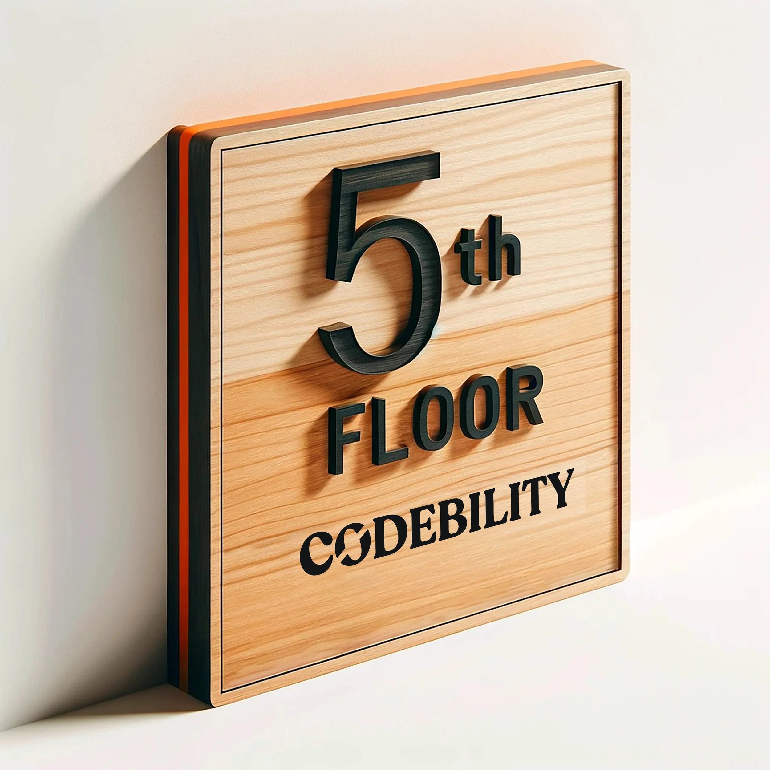
Oak is a hardwood with a natural grain that adds warmth and texture. It's durable enough for high-traffic commercial spaces and takes stain and paint well. For elements that won't change—like "The Fifth Floor"—we used stained black wood letters routed into the surface. These become a permanent part of the sign.
For the tenant name ("Codebility"), we used removable vinyl lettering. Vinyl is practical in multi-tenant buildings because it can be peeled off and replaced when a company moves out. The combination of permanent and changeable elements on the same sign reduces long-term costs and turnaround time for updates.
Design details: Color, contrast, and edge treatment
The edges of this sign are painted vivid orange, with a thin black line inset-routed around the perimeter. That combination does two things:
- Draws attention. The orange edge catches the eye from down the hall, helping visitors spot the sign before they reach it.
- Creates depth. The black inset line adds a shadow effect that makes the sign feel more dimensional and refined.
These color choices also align with the aesthetic many Bay Area tech companies prefer: bold, modern, and slightly playful without being unprofessional.
How we mounted it: Standoffs for visibility
This sign is mounted with metal standoffs, lifting it about an inch off the wall. Standoff mounting has a few advantages:
- Visibility. A raised sign is easier to see from an angle, which matters in busy hallways.
- Depth. The gap between the sign and the wall creates a shadow that adds visual interest.
- Cleaner look. Standoffs eliminate the need for visible screws or adhesive, keeping the front face of the sign uncluttered.
Proper installation requires precise hole placement and the right fasteners for the wall type. We handle installation for clients who want the sign mounted correctly the first time.
Why this approach works for tech offices
Tech companies often occupy modern office spaces with open layouts, glass walls, and minimal signage. A sign like this one fits that environment because it's:
- Functional without being sterile. The oak wood adds warmth; the bold colors add energy.
- Adaptable. Vinyl tenant names can be updated without replacing the whole sign.
- Brand-reinforcing. The design can be customized to match brand colors, typography, or other interior elements.
A well-executed wayfinding sign tells visitors—consciously or not—that the company pays attention to details. It's a small thing that contributes to a larger impression.
What to consider when ordering wayfinding signage
If you're planning wayfinding signage for an office, here are a few questions to think through:
- What needs to change over time? Identify which elements should be permanent (floor numbers, building name) and which should be swappable (tenant names, room labels).
- Where are the decision points? Place signs where people need to choose a direction—lobbies, elevator banks, hallway intersections.
- What's the viewing distance? Text size and color contrast should match how far away people will be when they need to read the sign.
- What's the wall material? Mounting hardware depends on whether the wall is drywall, concrete, glass, or something else.
We're happy to walk through options during a project consultation. Start a project to get the conversation going.